Apropos the earlier post on reducing inequality, we have this chart, based on CBO data:
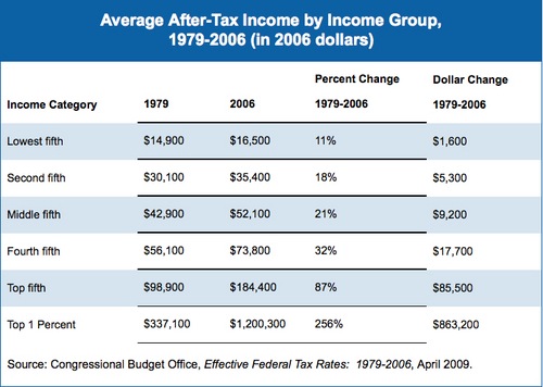
We had a rising tide, all right, but it didn’t trickle down to all boats. Or whatever…
via Matthew Yglesias
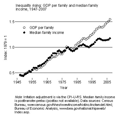
While we’re at it, here’s a chart from Lane Kenworthy that’s part of that same reducing-inequality package. Something happened, it seems, around 1980, and again around 2000.