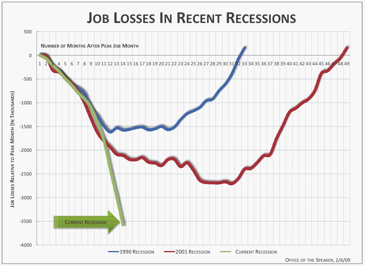
via Time Magazine
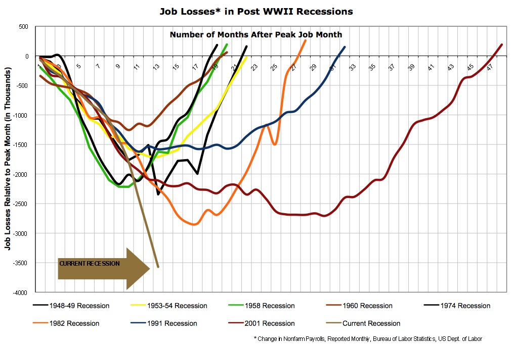
Update: via Barry Ritholtz, the same graph extended to all post-WW2 recessions. Click either graph for a bigger version.
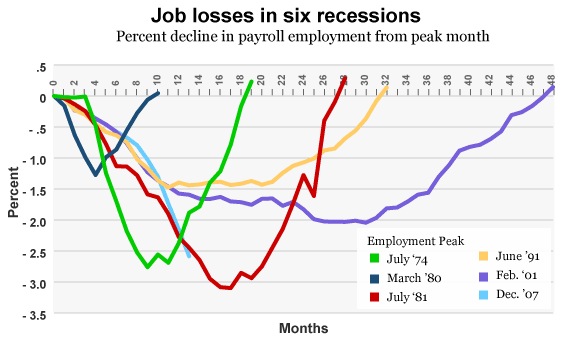
And while we’re at it, one more view, same as the previous graph but in percentages rather than absolute numbers (and fewer recessions).


