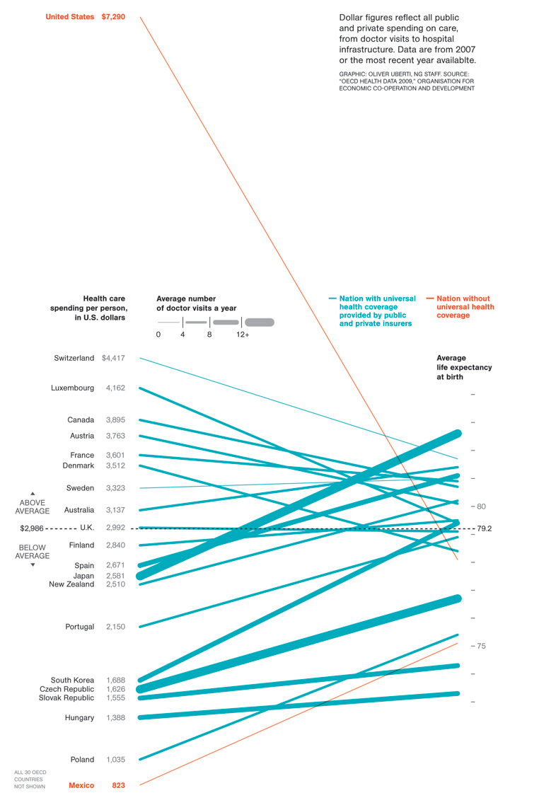
With apologies for the rather large image size, here’s a depressing graphic from the National Geographic via Andrew Sullivan, who comments:
This National Geographic chart, which I stumbled upon while reading that magnificent magazine on the airplane, truly blew me away. If anyone can look at this and not see a simply insane way to distribute health care, a system so inefficient no socialist country could ever replicate it, then they have stronger rationalization skills than I possess. …

Having just finished Outliers by Malcolm Gladwell, it’d be interesting to tease this apart a bit. He outlined other factors influencing life expectancy. see http://www.nytimes.com/2008/11/30/books/chapters/chapter-outliers.html
What would such an experiment look like? How do you isolate those with coverage from those who don’t when the underlying interest has to do with sociological factors?